Why your users drop off before they convert
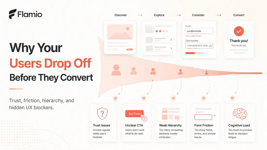
Users often drop off before conversion because of trust gaps, unclear CTAs, weak hierarchy, form friction, and hidden cognitive load.
Most product teams notice drop-off too late. They see the number in analytics. They know that users visited the landing page, started onboarding, opened the pricing page, added something to the cart, or began filling out a form. Then, somewhere before the final step, they disappeared. The easy answer is usually: "We need more traffic." But traffic is rarely the full problem. If users are already entering the flow and still leaving before conversion, the issue is not only acquisition. It is trust, clarity, friction, hierarchy, and effort. It is the small set of invisible moments where the user quietly decides, "I am not sure this is worth it." Conversion optimization is often treated like a numbers game. Change a button color. Move a headline. Test a shorter form. Add urgency. Remove one step. Sometimes these changes help, but they do not always explain the deeper reason behind user drop-off. The real question is not only where users leave. The better question is why the flow stopped making sense to them.
Drop-off usually starts before the exit
A user rarely drops off at the exact moment when the problem begins. The exit point is only the visible result. The real friction often starts earlier. A user might abandon a signup form because it asks for too much information. But the doubt may have started on the previous screen, where the value proposition was unclear. A user might leave the checkout page, but the real issue may have been weak trust signals on the pricing page. A user might ignore the CTA, not because the button is broken, but because the hierarchy never made the next step feel obvious. This is why product analytics can be useful but incomplete. It can show that 42 percent of users left after step three. It can show that conversion dropped after a redesign. It can show that one funnel performs worse than another. But product analytics alone often cannot explain what the user was feeling, misunderstanding, doubting, or struggling with in the seconds before they left. And those seconds matter.
Trust is a conversion feature
Trust is one of the biggest hidden reasons behind user drop-off. Users do not only ask, "Can this product solve my problem?" They also ask, often silently, "Do I believe this product?" "Do I feel safe here?" "Is this worth my time?" "Will I regret clicking this?" Trust can break in many small ways. A vague headline creates uncertainty. A pricing page without enough context creates hesitation. A form asking for sensitive information too early creates resistance. A checkout page without clear reassurance creates doubt. A product onboarding flow that feels generic can make users wonder whether the product actually understands their needs. None of this always appears as a dramatic event in analytics. The user does not click a button called "I lost trust." They simply slow down, pause, scroll back, move the cursor around, reread the same section, or leave. That is why trust should not be seen as decoration. It is part of the conversion flow. Good trust design answers questions before users have to ask them. It explains what will happen next. It makes the cost clear. It shows why the action is safe. It reduces the feeling of risk. When trust is weak, even a technically functional flow can feel unsafe.
Unclear CTAs make users work too hard
A call to action is not just a button. It is a decision point. When a CTA is unclear, users have to interpret what the product wants them to do. Should they book a demo, start a trial, create an account, contact sales, continue setup, upload a file, invite a teammate, or choose a plan? Too many choices can create hesitation. A vague button label can create confusion. A CTA placed too early can feel pushy. A CTA placed too late can make the page feel passive. A button that looks secondary can weaken the main path. This is where UX friction becomes subtle. The user may still understand the page, but not understand the next action strongly enough to take it. For conversion, clarity beats cleverness. Users should not have to decode the next step. They should feel guided. A strong CTA does three things. It tells users what they are doing, why it matters, and what happens after they click. If that is missing, users may not reject the product. They may simply postpone the decision until later. And "later" usually means never.
Forms are where intent often dies
Forms are one of the most common places where user intent turns into user drop-off. The user may be interested. They may understand the product. They may even be ready to convert. Then the form asks for too much, too soon, or in a way that creates unnecessary effort. Every form field is a small negotiation. The user gives information in exchange for expected value. When that exchange feels unbalanced, friction appears. Asking for a phone number before explaining why. Asking for company size when it does not feel relevant. Requiring account creation before the user understands the product. Splitting simple actions across too many steps. Showing error messages that are vague or easy to miss. Making users re-enter information after a failed submission. These are not minor details. They are conversion blockers. The problem is that form friction is often misread. A team may conclude that users are not interested enough. In reality, users may be interested but unwilling to push through avoidable effort. Good forms respect momentum. They ask only what is needed. They explain why something is required. They make errors easy to fix. They make progress visible. Most importantly, they do not punish users for trying to convert.
Cognitive load is the invisible tax on conversion
Cognitive load is one of the least visible but most damaging causes of drop-off. It happens when users have to think too much. They have to compare too many options. They have to remember information from a previous step. They have to understand unfamiliar terminology. They have to interpret vague labels. They have to guess what will happen next. They have to decide whether they are choosing the right plan, entering the right data, or taking the right action. Each extra mental step creates a little more resistance. This matters because users are not evaluating your product in perfect conditions. They are distracted. They are busy. They may be comparing alternatives. They may be uncertain about the problem itself. They may be testing your product between meetings, on a phone, or with limited patience. A flow that feels obvious to the team can feel heavy to a first-time user. Conversion optimization is not only about persuasion. It is also about reducing mental effort. The best flows make the next step feel natural. They remove unnecessary choices. They explain complexity at the right moment. They do not overload users before users have enough context to care.
The real problem is not the drop-off point
When users leave before they convert, the drop-off point is only the symptom. The deeper problem is usually one of interpretation. The user did not understand the value clearly enough. They did not trust the next step. They did not see the main action. They were asked for too much. They had to think too hard. They felt friction but never explained it. This is why teams need to look beyond funnel charts. A funnel can show where the leak is. But it cannot always show the crack that caused it. To fix user drop-off, teams need to understand behaviour in context. Where did users hesitate? What did they try to click? Which parts did they reread? Where did they slow down? Which elements distracted them? What happened before they exited? That is where user behaviour becomes more valuable than surface-level metrics.
How Flamio helps teams find the reason behind drop-off
Flamio approaches this problem by focusing not only on where users drop off, but why the flow broke before conversion. Instead of treating user behaviour as a set of raw events, Flamio is built around the idea that interfaces should understand human behaviour more intelligently. Its broader vision is to become an intelligence layer between digital interfaces and human behaviour, helping products detect hesitation, confusion, friction, cognitive overload, and behavioural patterns automatically. For product teams, this means Flamio is not just another way to watch recordings or collect analytics. It is designed to analyse user behaviour, detect friction, and turn recordings into clear product decisions. Its positioning is simple: most analytics tools show what users did, while Flamio explains what went wrong, why it matters, and what the team should improve next. That distinction matters for conversion optimization. If users abandon a signup flow, Flamio helps teams understand whether the issue was an unclear CTA, weak hierarchy, form friction, hesitation, confusion, or another behavioural signal that traditional metrics might flatten into a single drop-off number. The problem is not that teams lack data. The problem is that they often lack interpretation. Flamio helps close that gap by turning user behaviour into actionable UX insights, so teams can fix broken flows faster and make conversion decisions based on evidence instead of assumptions.
Takeaway
Users rarely drop off for no reason. The real work is understanding the trust, clarity, friction, hierarchy, and effort problems that appeared before they left.
Keep reading
More Flamio notes
How 2-minute user tests can change product decisions
Short, focused usability tests help teams escape opinion loops and make product decisions from real user behavior instead of internal assumptions.
ProductWhy most startups validate ideas too late
Many startups wait until launch to validate their product experience, when learning is already expensive and every UX issue is harder to change.
ResearchWhy product designers need to think like researchers
Product designers need research thinking to understand user behaviour, challenge assumptions, and connect design decisions to real product outcomes.