The difference between product Analytics and UX Analytics
Product analytics shows what happened at scale. UX analytics explains the behavior and friction behind those metrics so teams can make clearer product decisions.
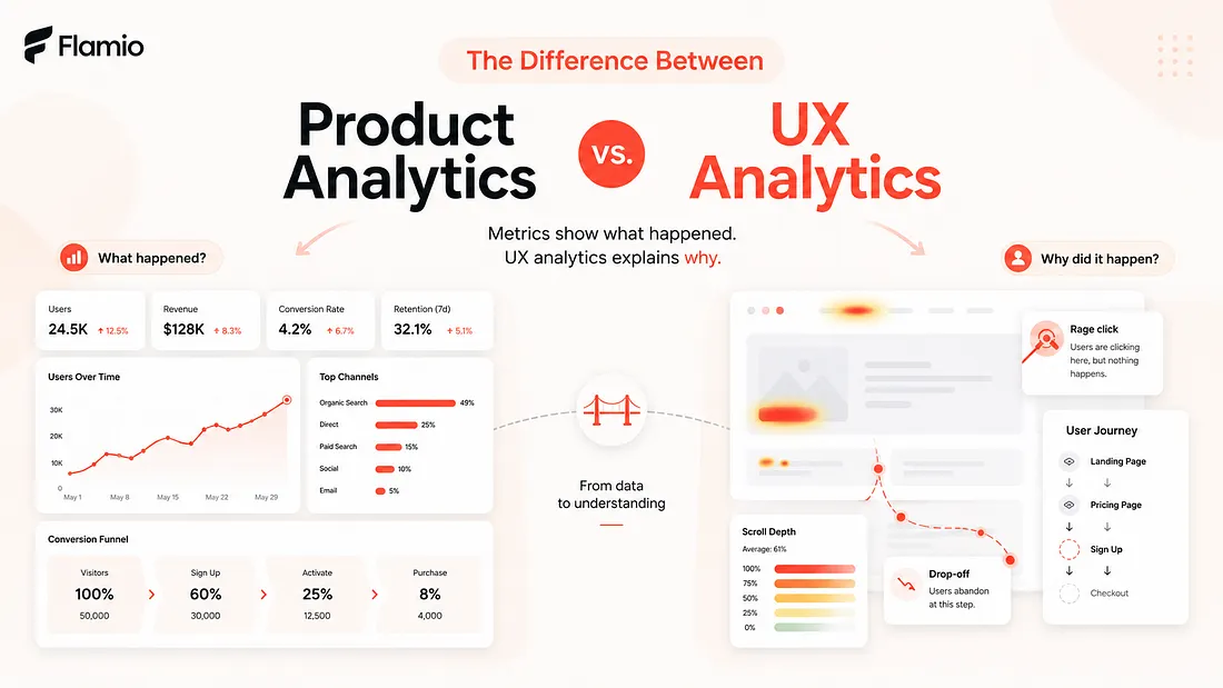
Most product teams already track something. They know how many users signed up. They know where conversion drops. They know which feature gets opened, which button gets clicked, and which funnel step loses the most people. This is the world of product analytics, and it is extremely useful. Without it, teams would be building almost blindly. But there is a problem. Metrics can tell you that something happened. They rarely explain the human reason behind it. A signup form may have a 42% drop-off rate. A dashboard feature may have low adoption. A checkout step may lose users right before payment. Product analytics can highlight these moments very clearly, but the deeper question remains open: why did users behave that way? That is where UX analytics becomes important. Product analytics helps teams understand product performance. UX analytics helps teams understand user behaviour. One shows the outcome. The other helps explain the experience that created the outcome.
Product Analytics shows what happened
Product analytics is focused on measurable product activity. It tracks events, funnels, conversion rates, retention, activation, feature usage, user segments, and other quantitative signals. It answers questions like: How many users completed onboarding? Where do users drop off? Which features are used most often? How frequently do users return? Which acquisition channel brings better retention? These answers are valuable because they help teams see patterns at scale. Product analytics turns user activity into numbers that can be compared, monitored, and improved over time. For example, if a team sees that only 18% of users finish onboarding, that is a clear signal that something is wrong. If a newly launched feature has very low adoption, the team knows it should investigate. If users who complete a certain action are more likely to retain, the team can optimize around that action. Product analytics is great at identifying where attention is needed. But it often stops at the moment when the most important work begins. Knowing that users drop off on step three does not automatically explain what step three feels like. It does not show whether the copy is unclear, the layout is confusing, the form feels too long, the CTA is weak, or the user simply does not understand what will happen next. The metric shows the symptom. It does not always explain the friction.
UX Analytics explains the behaviour behind the metric
UX analytics looks closer at the experience itself. Instead of only asking what users did, it asks how they behaved while doing it. Did they hesitate? Did they move back and forth between sections? Did they click something that was not clickable? Did they scroll past important information? Did they pause before submitting a form? Did they seem confused by the interface structure? This is where user behaviour becomes more meaningful than a simple event count. A product analytics dashboard may show that users did not click the primary CTA. UX analytics may show that users never noticed it because the visual hierarchy was weak. Product analytics may show that users abandoned a pricing page. UX analytics may reveal that they were comparing plans, rereading the same section, and struggling to understand which option fit them. These are different levels of understanding. Product analytics tells the team that a page underperforms. UX analytics helps the team understand what the user experienced on that page. That difference matters because good product decisions depend on interpretation, not only measurement. A team can see a conversion problem and still choose the wrong fix if they misunderstand the cause. They may rewrite copy when the real issue is layout. They may redesign a button when the real issue is trust. They may remove a step when the actual problem is that users do not understand why the step exists. UX insights reduce that guesswork.
Metrics are clean, behaviour is messy
One reason product analytics became so popular is that metrics are structured. They fit neatly into charts, dashboards, reports, and weekly reviews. A number goes up or down. A funnel improves or worsens. A cohort retains or churns. Human behaviour is less tidy. Users do not move through products like perfectly logical data points. They hesitate. They second-guess. They misread things. They get distracted. They make assumptions. They bring previous experiences, expectations, and doubts into every interface. This is why behavioural analytics is so useful. It captures the messy middle between intent and action. A user might want to buy, but not trust the page. A user might want to sign up, but feel unsure about what information is required. A user might want to use a feature, but not understand where to begin. From a pure event-tracking perspective, these users may simply look inactive or unconverted. From a UX analytics perspective, they are showing signals of friction. The product did not only fail to convert them. It failed to guide them. That is an important distinction.
Product Analytics is better for scale
Product analytics works best when a team needs a broad view of performance. It is useful for tracking long-term trends, comparing segments, measuring experiments, and understanding how different parts of the product contribute to growth. It helps teams prioritize. If one funnel step loses far more users than the others, that is probably a good place to investigate. If retention drops after a specific feature interaction, that may point to a deeper product issue. This scale is powerful. Product leaders, growth teams, and founders need this type of visibility because they cannot make decisions based only on individual user stories. They need to know how often a problem happens, how large the impact is, and whether changes are moving the product in the right direction. But scale can also create distance. When user behaviour is compressed into percentages, the actual experience can disappear. A dashboard may show a beautiful funnel chart while the real user journey feels confusing, stressful, or unclear. The team can see the decline, but not the struggle behind it. That is why product analytics should not be treated as the whole truth. It is a map of outcomes, not a full explanation of experience.
UX Analytics is better for diagnosis
UX analytics works best when a team needs to understand friction. It is especially useful around onboarding, checkout, activation flows, signup forms, landing pages, dashboards, new feature adoption, and any part of the product where user understanding matters. These are moments where small UX problems can create large business consequences. A confusing field label can reduce form completion. A weak CTA can lower activation. A poorly structured pricing section can reduce trust. A dashboard with too many competing elements can make users feel lost. None of these problems are always obvious from metrics alone. UX analytics helps reveal the quality of the interaction. It gives teams a way to move from "users are dropping off" to "users are likely dropping off because this part of the flow creates confusion." That shift is where better product decisions begin. The goal is not only to collect more user behaviour data. The goal is to interpret behaviour in a way that leads to action.
The best teams use both
Product analytics and UX analytics should not compete with each other. They answer different questions. Product analytics helps a team find the problem area. UX analytics helps explain what is happening inside that area. Product analytics says, "This step is underperforming." UX analytics says, "Here is what users are experiencing when they reach it." Together, they create a much stronger learning loop. A team might start with product analytics and notice that users are dropping off during onboarding. Then UX analytics can help reveal whether the issue is unclear instructions, too many steps, poor visual hierarchy, low trust, or a mismatch between user expectations and the actual flow. After the fix, product analytics can measure whether completion improves. This creates a cycle: Measure the outcome. Understand the behaviour. Improve the experience. Measure again. That cycle is much stronger than relying on metrics alone or watching isolated user sessions without knowing their scale.
Why this difference matters more than ever
Product teams are under pressure to move faster. Founders need validation before they spend months building the wrong thing. Designers need evidence for decisions, not just opinions. Product managers need to understand why users behave the way they do, not only whether a KPI moved. Teams are already surrounded by data, but more data does not automatically create more clarity. The real challenge is interpretation. Many teams know where users drop off, but they do not know why. They know which features are ignored, but they do not know what made users ignore them. They know conversion is lower than expected, but they do not know whether the problem is value, trust, clarity, usability, or timing. This is the gap between product analytics and UX analytics. Product analytics gives teams visibility into performance. UX analytics gives teams visibility into experience. One is necessary for growth. The other is necessary for understanding.
How Flamio bridges the analytics gap
The core problem is not that product teams lack data. The problem is that raw behaviour data is often difficult to interpret quickly. Teams can collect recordings, track events, build funnels, and monitor drop-off points, but they still need to understand what the user experience actually means. That requires time, attention, and UX judgment. For small teams, founders, and fast-moving product organizations, this is often the slowest part of the learning process. Flamio is built to act as a bridge between user behaviour and actionable UX insights. It is not positioned as another analytics dashboard or another place to store recordings. Its purpose is to help teams understand behaviour more directly by detecting friction, hesitation, confusion, and patterns that point to broken flows. Flamio own positioning describes it as an intelligence layer between digital interfaces and human behaviour, focused on turning behaviour into clearer product decisions. That is the difference that matters. Product analytics can show that something is wrong. UX analytics can help explain why. Flamio pushes this one step further by helping teams turn those behavioural signals into practical UX insights they can act on, faster. Instead of leaving teams with more dashboards to interpret, Flamio helps them move from "users dropped off here" to "this is likely what created the friction, and this is what should be improved next."
Takeaway
Product analytics helps teams see product performance, while UX analytics helps explain the human experience behind that performance.
Keep reading
More Flamio notes
How 2-minute user tests can change product decisions
Short, focused usability tests help teams escape opinion loops and make product decisions from real user behavior instead of internal assumptions.
ProductWhy most startups validate ideas too late
Many startups wait until launch to validate their product experience, when learning is already expensive and every UX issue is harder to change.
ResearchWhy product designers need to think like researchers
Product designers need research thinking to understand user behaviour, challenge assumptions, and connect design decisions to real product outcomes.