Dead clicks, rage clicks and hesitation: what user behaviour really tells us
Dead clicks, rage clicks, and hesitation reveal the hidden friction behind product metrics, showing where users lose confidence before they drop off.
Most product teams are trained to look at the obvious numbers. Conversion rate. Bounce rate. Time on page. Drop-off rate. Retention. Activation. These metrics matter, of course. They show whether something is working at a business level. But they rarely explain what actually happened inside the user mind before the number appeared on a dashboard. A user does not wake up one day and decide to "drop off." They hesitate. They reread. They click something that looks clickable. They move back and forth between two sections. They try the same button again because they are not sure whether the first click worked. They pause at a form field because the label is unclear. They scroll up because the next step does not make sense. By the time a standard metric shows a problem, the user has already experienced several smaller moments of friction. Dead clicks, rage clicks and user hesitation are not just tiny interaction details. They are traces of confusion. They show where an interface breaks the user expectation, even when the overall flow still looks "fine" in traditional analytics.
The problem with looking only at standard metrics
Industry standard metrics are useful, but they are often too far away from the actual user experience. A checkout conversion rate can tell you that 63% of users did not complete a purchase. It cannot tell you that many of them clicked a disabled promo code button three times before leaving. A signup funnel can tell you that users dropped off on step two. It cannot tell you that they hesitated for 20 seconds because the form asked for information they did not expect to provide yet. This is where product teams often get stuck. They know something is wrong, but they do not know what to fix. The result is guesswork. Designers adjust copy. Product managers simplify steps. Founders ask for more data. Teams run more meetings. But without understanding the behaviour behind the metric, every decision is still partly based on assumption. Behavioural analytics becomes more valuable when it helps teams see not only what users did, but how they struggled while doing it.
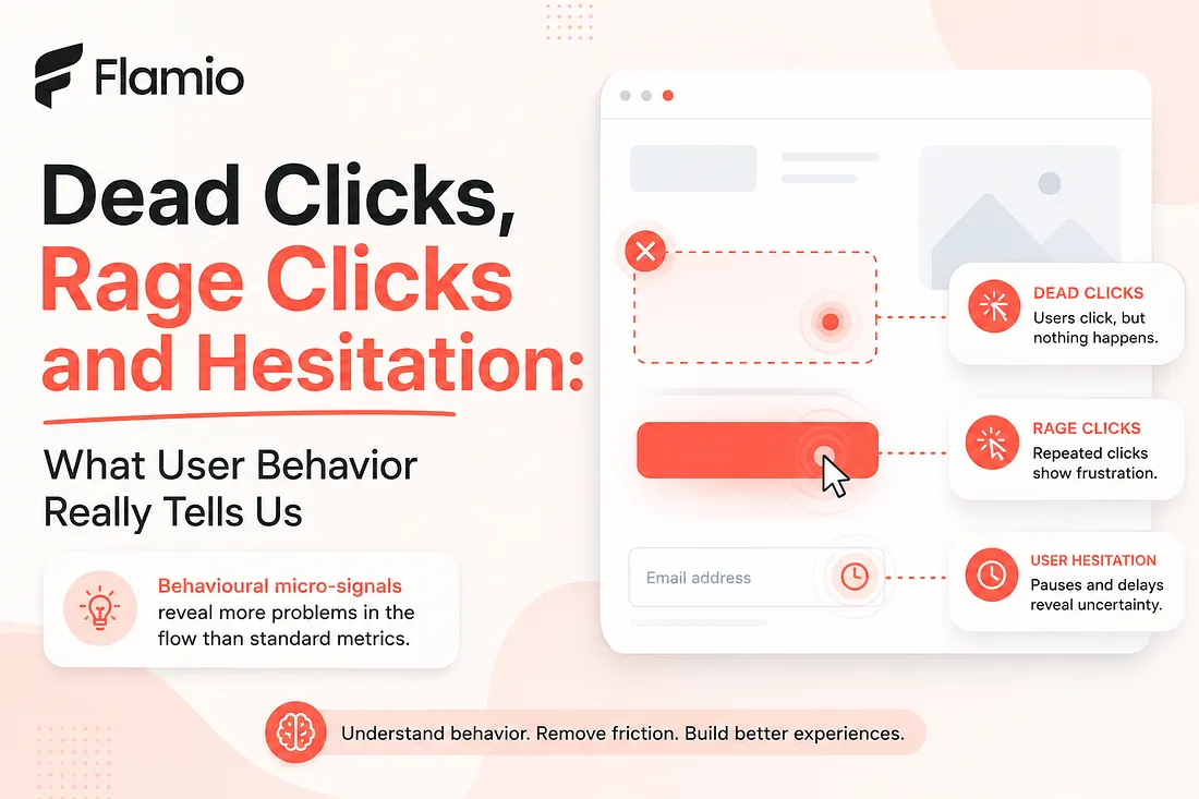
Dead clicks reveal broken expectations
A dead click happens when a user clicks something that does not respond. Sometimes it is a card that looks like it should open. Sometimes it is an icon that appears interactive. Sometimes it is a label, image, empty state, menu item or section header that visually invites action but does nothing. On the surface, a dead click can look harmless. One user clicked in the wrong place. No big deal. But repeated dead clicks across multiple users usually point to a deeper issue: the interface is making a promise it does not keep. Users do not click randomly. Most of the time, they click because the visual design suggests an affordance. A color, shape, underline, hover state, border, placement or icon makes them believe that something should happen. When nothing happens, the product creates a small break in trust. That break may not immediately cause churn. It may not appear as a dramatic drop-off. But it adds friction. It makes the interface feel slightly less intuitive. It forces the user to reinterpret the screen and search for the real path forward. A dead click is often the user saying, without words, "I thought this was the way."
Rage clicks show frustration in real time
A rage click is usually a sequence of repeated clicks in the same area within a short period of time. It often happens when users expect the interface to react, but it does not react quickly, clearly or at all. This signal is important because it captures frustration while it is happening. A user may rage click because a button is slow. They may rage click because they missed a validation message. They may rage click because the page looks frozen. They may rage click because the next action is technically working, but the feedback is too subtle to notice. In many cases, the system is not fully broken. That is what makes rage clicks so easy to ignore. The backend works. The button works. The form works. The modal eventually opens. But from the user perspective, the product feels unreliable in that moment. This distinction matters. A product can be technically functional and still feel broken. Rage clicks reveal the emotional layer of UX friction. They show where users lose patience, where confidence drops and where the product fails to communicate clearly enough.
Hesitation is often the most underrated signal
Dead clicks and rage clicks are visible because they are active. Hesitation is quieter. A user pauses before clicking. They hover over two options. They scroll down, then up, then down again. They stop at a pricing block. They stay on a form field longer than expected. They move the cursor toward one button, then choose another. This kind of behaviour is easy to miss if a team only looks at completed events. After all, the user may still finish the flow. The signup may still happen. The purchase may still go through. But hesitation reveals cognitive load. It shows where the user had to think harder than they should have. It points to unclear messaging, confusing hierarchy, missing context, weak labels or decision anxiety. It is especially important in onboarding, checkout, pricing, upgrade flows and feature adoption, where users need confidence before moving forward. A user who hesitates is not always confused. Sometimes they are comparing options. Sometimes they are being careful. But when hesitation appears repeatedly in the same part of a flow, it is rarely accidental. It means the interface is asking for more mental effort than expected.
Micro-signals help teams see friction earlier
The biggest value of behavioural micro-signals is that they appear before the big metric gets worse. Before users abandon a form, they hesitate. Before they leave a page, they missclick. Before they complain to support, they rage click. Before a feature underperforms, users struggle to understand what it does. These signals give product teams a chance to react earlier. Instead of waiting for a conversion problem, teams can identify where the experience already feels unstable. Instead of debating opinions, designers can point to real behaviour. Instead of guessing why users drop off, product managers can connect the drop-off to specific interaction patterns. This is especially useful for startups and early-stage products, where every lost user matters. A small point of UX friction can have a large impact when the product is still trying to prove activation, retention or willingness to pay. At that stage, teams cannot afford to wait weeks for perfect research cycles. They need faster insight loops. They need to understand where users hesitate before they lose them.
Why these signals are better than opinions alone
User feedback is valuable, but it has limits. People do not always remember where they struggled. They may describe the experience differently after the fact. They may say the flow was "fine" even if their behaviour showed confusion. They may blame themselves for not understanding something that was actually poorly designed. Behaviour is often more honest than memory. A user might not mention that they clicked a non-clickable card three times. They might not report that they paused on a pricing section because the plan difference was unclear. They might not remember that they went back to reread the onboarding step before continuing. That is why dead clicks, rage clicks and hesitation are so useful. They do not replace interviews, usability tests or product judgment. They add another layer of evidence. They help teams move from what users say to what users actually experience. Good product decisions usually come from combining both: what users explain and what their behaviour reveals.
The real question is not what users did
Many analytics systems are built around actions. Clicked. Viewed. Submitted. Converted. Dropped off. Returned. Those actions are useful, but they are incomplete. The more interesting question is not only what users did. It is what happened between those actions. Did they move smoothly? Did they hesitate? Did they click something that was not interactive? Did they repeat an action because feedback was unclear? Did they abandon after encountering friction, or did they push through despite it? The space between events is where UX friction often lives. A clean funnel chart can hide a messy experience. A completed signup can still include confusion. A successful purchase can still include unnecessary doubt. A user who reaches the final step may still leave with less trust in the product than they had at the beginning. Those micro-signals help uncover that hidden layer.
From raw behaviour to better decisions
The challenge is that behavioural data can quickly become overwhelming. Watching recordings manually takes time. Interpreting every click, pause and movement requires attention. Teams may collect plenty of behaviour data but still struggle to turn it into clear product decisions. That is the gap many teams face today. They do not need more raw data for the sake of data. They need faster interpretation. They need to know which signals matter, which patterns repeat and which parts of the flow deserve attention first. Dead clicks, rage clicks and hesitation are powerful because they make invisible friction visible. But their real value appears only when teams can translate them into action. A dead click should lead to a clearer affordance. A rage click should lead to better feedback or faster response. A hesitation pattern should lead to simpler copy, stronger hierarchy or better explanation at the right moment. The goal is not to obsess over every cursor movement. The goal is to understand where the interface stops feeling natural.
From user struggle to actionable UX insight
The core problem is simple: standard metrics often tell teams that something went wrong, but behavioural micro-signals show where and how the friction actually happened. Dead clicks reveal broken expectations. Rage clicks expose frustration. User hesitation shows uncertainty and cognitive load. Together, they give product teams a clearer view of the real experience behind the numbers. Flamio is built around this exact shift. Instead of positioning itself as another analytics dashboard, Flamio focuses on the layer between digital interfaces and human behaviour, helping teams understand signals like intent, hesitation, confusion, friction, cognitive overload and behavioural patterns. Its direction is not only to collect user actions, but to turn behaviour into clearer understanding. In practical terms, Flamio works as an AI UX research assistant that watches user behaviour, detects friction and turns recordings into clear product decisions. The source strategy describes the product as a way to move beyond raw behaviour data toward faster interpretation and actionable UX insights, which is exactly what teams need when micro-signals start revealing problems hidden inside the flow.
Takeaway
Dead clicks, rage clicks and hesitation help teams see the friction hidden between standard analytics events, turning invisible struggle into clearer UX decisions.
Keep reading
More Flamio notes
How 2-minute user tests can change product decisions
Short, focused usability tests help teams escape opinion loops and make product decisions from real user behavior instead of internal assumptions.
ProductWhy most startups validate ideas too late
Many startups wait until launch to validate their product experience, when learning is already expensive and every UX issue is harder to change.
ResearchWhy product designers need to think like researchers
Product designers need research thinking to understand user behaviour, challenge assumptions, and connect design decisions to real product outcomes.